
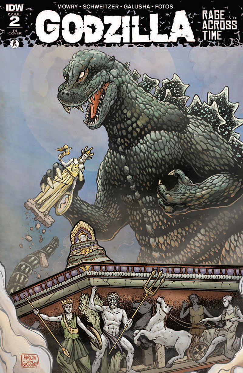
 Click on the image for a look at the completed Retailer Incentive cover for issue #2 of Godzilla: Rage Across Time. Image courtesy of Aaron John Gregory. © 2016 Toho Co., Ltd.
Author/Source: Aaron John Gregory
Official Site: IDW Publishing
Special Thanks to Bobby Curnow
A SCIFI JAPAN EXCLUSIVE
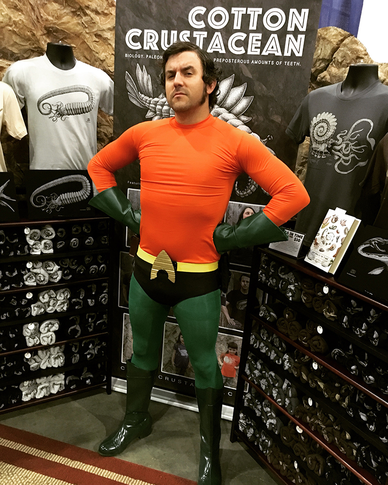 Artist Aaron John Gregory at WonderCon 2016, Los Angeles, with his company, Cotton Crustacean. Photo courtesy of Aaron John Gregory.
Artist Aaron John Gregory has offered SciFi Japan readers an exclusive step-by-step look at the making of his cover illustration for Godzilla: Rage Across Time.
Godzilla: Rage Across Time is a five part comic book mini-series debuting this week from IDW Publishing that features Godzilla and other Toho monsters during different eras of Earth’s history. Each issue is produced by a different creative team and comes with multiple cover variants. Aaron has created artwork for the Retailer Incentive cover of the second issue, which will be available from comic book shops and retailers on September 21st.
While Godzilla: Rage Across Time is Aaron`s first comic book assignment, he is no newcomer to the art world. Class valedictorian from the Academy of Art, University in San Francisco with a BFA in Illustration, as well as being an alumni of the Kubert School of Graphic Art, Aaron is a professional illustrator and graphic cartoonist specializing in biological illustration. He and his wife have a boutique clothing company called Cotton Crustacean, featuring Aaron`s scientific illustrations of prehistoric marine life on premium American Apparel tees. When not drawing, he plays guitar and sings in the progressive rock band, GIANT SQUID.
The following text and images are courtesy of Aaron John Gregory...
Hi everyone! Aaron John Gregory here, from Pacifica, CA, a little coastal town just south of San Francisco. I’m honored to be asked by SciFi Japan to share my work flow and all around process on my latest cover illustration (above) for the second issue of IDW Comics` Godzilla: Rage Across Time, written by Chris Mowry and Kahlil Schweitzer, with interior art by Tadd Galusha.
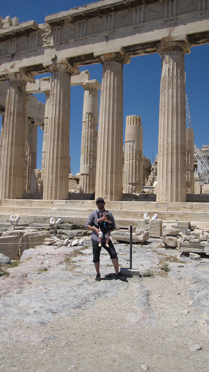 My daughter and I at the Acropolis Parthenon, Athens Greece, 2012. Photo courtesy of Aaron John Gregory.
Let`s get started!
CONCEPT:
The second issue of Rage Across Time drops Godzilla right in the middle of an ancient Greek fantasy setting, ruled by the Gods of Olympus, some of which you know go toe to toe with Godzilla! So I have to admit that this cover job was dream come true in many ways; it combined my deep love of ancient Greece with my life-long mega-fandom of Godzilla. Being a major art history buff as well, I previously traveled through Greece with my family, where I stood for many contemplative hours in the shadows of incredible ruins like the Palace of Knossos on Crete and the mammoth Parthenon in Athens, the later of which I knew had to be a major part of this comic cover.
Further pondering the Parthenon and what Godzilla could do to it -- other than completely smash it -- I recalled that this iconic structure was originally a temple to Athena, and housed an enormous golden statue of her deep within, known as the Athena Parthenos. For reasons unknown, this massive piece of art was sadly lost to history, but I think I know where it went... Godzilla took it!! The idea of Godzilla ripping that enormous statue out of that colossal building, was too good to pass up.
 Some of the misc reference photos I used for this job. The bottom left one I took in Athens. Photos courtesy of Aaron John Gregory. Godzilla © Toho Co., Ltd. Image courtesy of Aaron John Gregory. © 2016 Toho Co., Ltd.
At this point I gathered my initial batch of reference. I discussed with the book author, Chris Mowry, what era of Godzilla suit we were looking at doing, which was a toss up between the original 54 Gojira and/or the evil GMK suit. But as the other covers came in, and Tadd started working on the interiors, it was clear any era of the Big G came up for grabs.
I still hovered more around the original Gojira appearance at first, but with some influence from my personal favorite Godzilla 1985 suit.
I also had to gather my Parthenon reference, which luckily, I had a lot of my own photos from my trip there. Especially helpful though was a pic I took of a small scale model of what the western frieze of the temple would have looked like before two thousand years of decay and damage took its toll and destroyed most of it. Thanks to the replica Parthenon in Tennessee, there are lots online photos of what the Parthenon likely originally looked like; especially when seen painted with its original vibrant colors.
The sculptures in the western pediment (triangular shape above the columns with the sculptures in it) of the Tennessee one do not match what has been reconstructed at the Athens Parthenon museum, unfortunately. I trust the Greeks, and so I drew it how it appears in the model I have a photo of.
 Images courtesy of Aaron John Gregory. © 2016 Toho Co., Ltd.
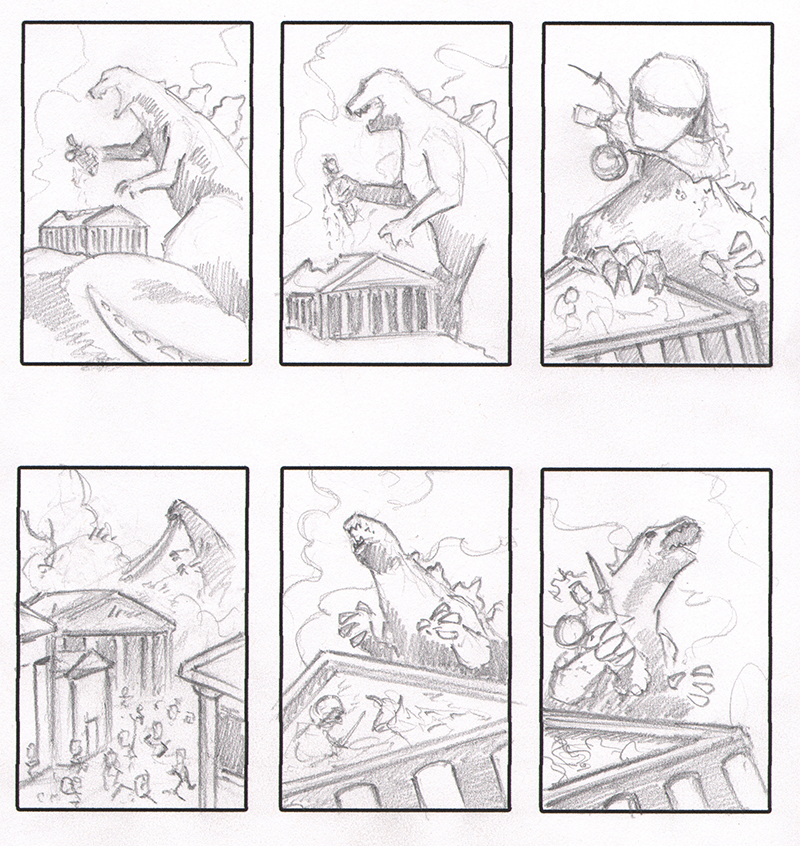
THUMBNAILS:
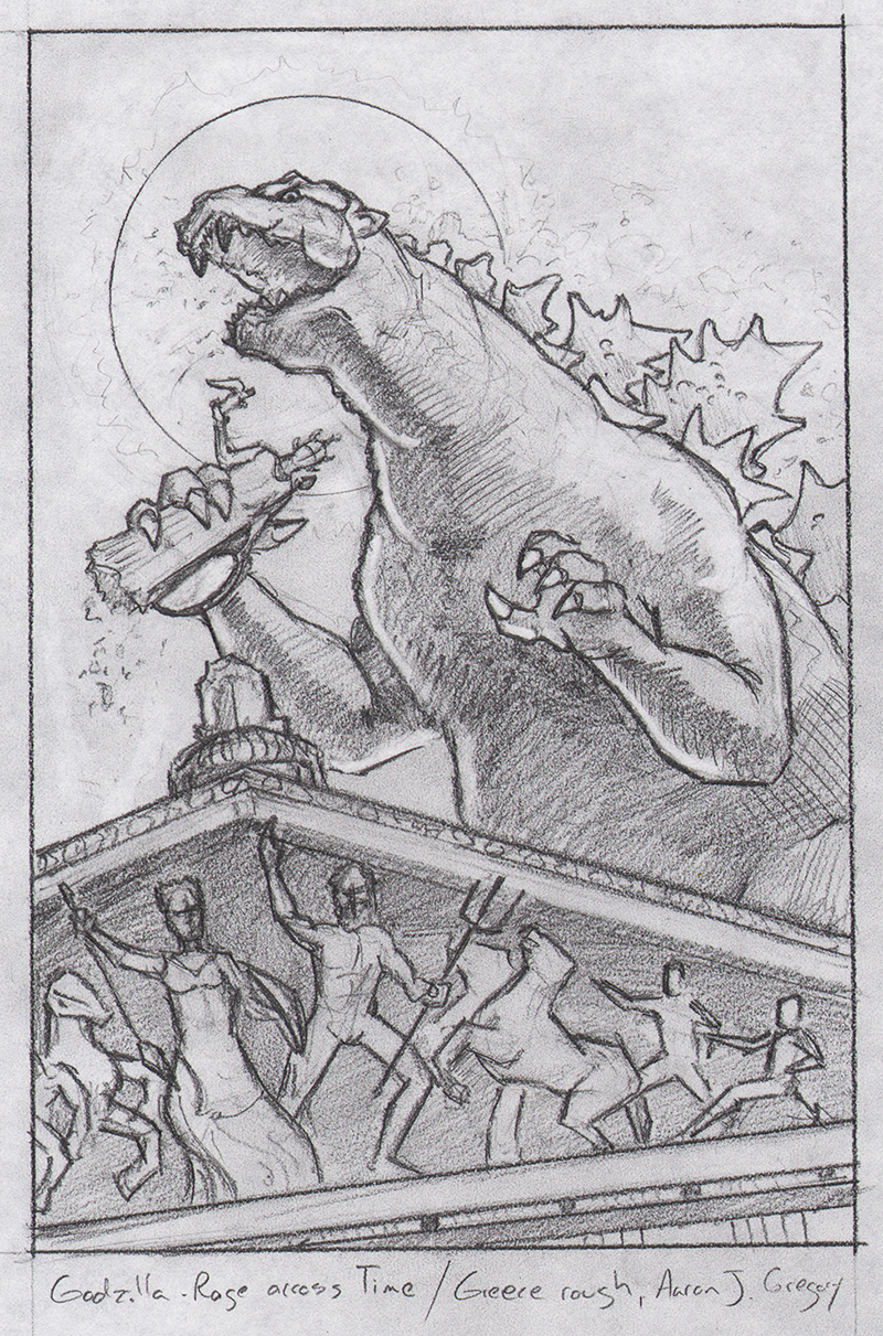
While thumbnails always felt like a chore in art school, they are an imperative step in the illustration process. For me, this is where 75% of the composition is figured out. Establishing elements like Godzilla and the Parthenon as simple shapes, plotting where shadows will be and how they embrace the focal point, creating interesting negative space, and aiming all the angles and straight lines precisely so the viewer`s eye moves around the piece naturally, creating flow and interest. Sometimes I have to make twenty of them before coming upon a design I like.
This time around, luckily, I only did six. By #5, I knew I had it; an interesting angle that allows the Parthenon to look huge, but still maintains that it is dwarfed by Godzilla.
Image courtesy of Aaron John Gregory. © 2016 Toho Co., Ltd.ROUGH PENCILS:
With roughs, the name of the game is tightening the composition, but I also try to draw the entire thing very quickly, allowing myself to warm up, and get the drawing muscles going; while also allowing myself to screw up as much as needed. Lots of erasing and figuring out the more finite details of the composition that can`t be dialed in with simple small thumbnails.
I tend to "shade" roughs tonally in a very loose way, in order to start thinking about where shadows and spotted blacks can be dropped in. In these pencil roughs, I attempted to utilize smaller details in the drawing, like the moon, Poseidon`s trident, or the peak of the Parthenon, to direct the viewer`s eye-flow around the piece, creating a hierarchy of focal points for people to move through. Godzilla`s head is the first focal point, the Athena Parthenos in Godzilla`s grasp is second, and Poseidon within the pediment frieze is third.
Toho`s comments at this point were, "Please make Godzilla to have scaly skin. Please make its neck shorter. (Godzilla’s neck shall not be separated in two. Please erase the bottom part of the neck.)".
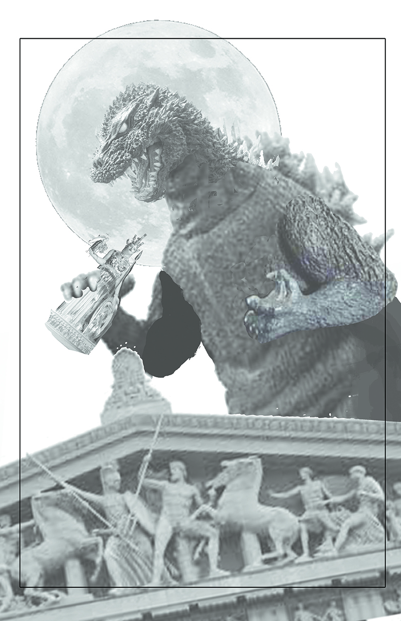 Image courtesy of Aaron John Gregory. © 2016 Toho Co., Ltd.
PHOTO COMP:
Creating a photo comp as a final reference image is a step I don`t do often. In this case, when needing the approval of TOHO Studios every step of the way, it`s a real good way to "stay on model" as they are sticklers for how Godzilla is portrayed. They`re very strict about everything from ear size to length of neck to the way his tongue lays in his mouth.
Still, I took the liberty of combining chunks from photos of various Godzilla models I found online, and built my own hybrid seen here. The arms, body, and head are all from different eras, ranging from the 54 Gojira to a very modern Hesei-Millienial mash-up (they`re all in my reference collage above) butchered together in Photoshop.
I then added a image of the Tennessee Parthenon`s western pediment, and suddenly I have a super solid composition to draw from. This being essentially another stage of roughs, I made a major change in the position of the head as I was really digging the look of that reference pic. When facing down, the viewer`s eye flow goes back down towards the Athena statue, instead of out into the sky and off the page, like I had it in my pencil roughs.
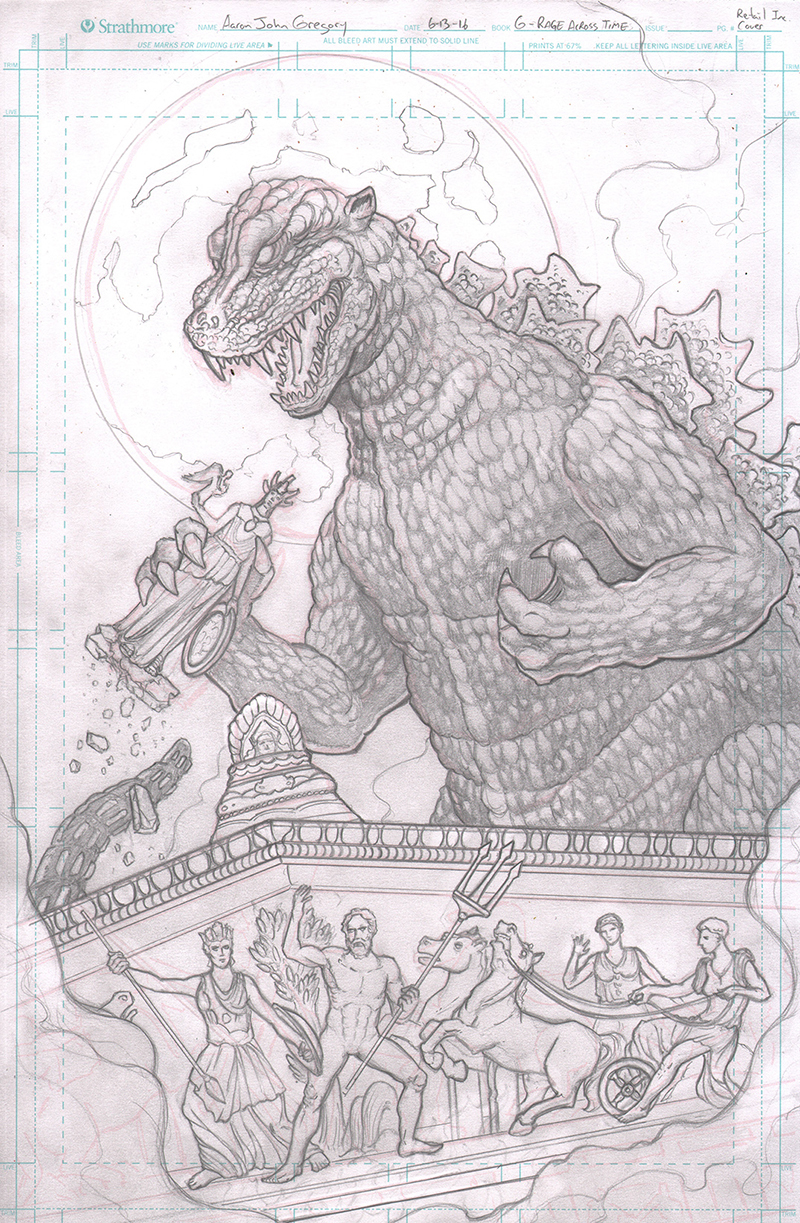 Image courtesy of Aaron John Gregory. © 2016 Toho Co., Ltd.
PENCILS:
With the photo comp on my monitor above my drawing table, in addition to some extra Parthenon pics, I dove into the tight pencils on a full size 11"x17" comic board.
I usually draw everything in softly with a 2B, then tighten everything up from there with a HB, and finally go in and "goose" all the holding lines and fine details with a mechanical pencil -- usually back at a 2B softness -- so I don`t engrave the paper as I have a bad habit of tending to press down hard at this stage.
Blacks were spotted, some textures were laid down or at least suggested, and the most finite details were established once and for all.
Toho`s feedback at this point was "Please make Godzilla’s nose slightly shorter and its ear less outstanding.".
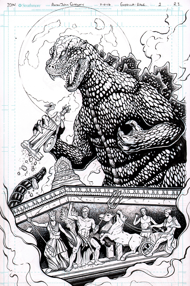 Image courtesy of Aaron John Gregory. © 2016 Toho Co., Ltd.
INKS:
This is my favorite part of any illustration. I love to ink!
For me, this is when textures pop spontaneously and grow organically. Lines suddenly become ridges and creases, with depth and shadow. The image grows in depth as bold lines push objects forward, thin lines push other objects back. Forms emerge out of darkness and then recede back in from the light. Half the time I ink I feel like I don`t know what the hell I`m doing. The other half is me just throwing every trick of the trade I know at the drawing, for better or for worse, until something really sings for me. I tend to attack inking like a painting; get lots of ink on the page, pull it out with white-out when needed, then add it back in when I change my mind again. Line thickness and spotted blacks are determined by my need to cover mistakes as much as account for light source.
Tool wise, I primarily use a size 2 Raphael Kolinsky sable brush (either model 8404 or the long haired 8408) for 75% of it, then various types of micron pens, like Sakura brand or Copic Multiliners. For quick fixes I use a nice Pentel brush pen. My ink of choice is the Koh-I-Noor Rapidograph refill black india ink, but I`ll use honestly anything I have in my box, from standard Speedball black drawing ink to FW acrylic ink.
Toho gave final approval at this point after seeing these inks and I was free to start coloring!
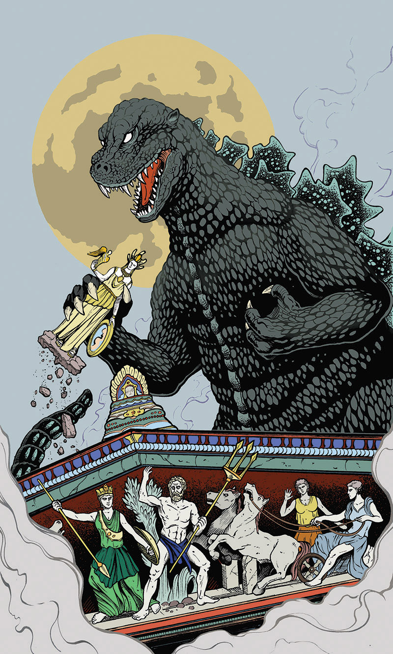 Image courtesy of Aaron John Gregory. © 2016 Toho Co., Ltd.
FLATS:
I have yet to meet anyone that really enjoys doing flats. There is a bit of zen to sitting down and getting your "coloring book" mode on, and it`s always exciting to see splashes of color start popping elements of your drawing out, but this is where all that warmed up drawing energy disappears as you tediously try to stay in the lines; keeping stray pixels from sneaking by, while making sure every single detail gets its own color. The more detailed a drawing, the more brutal the flats are.
All that griping aside, this is where I establish my local colors and values, which will direct all the coloring going forward. I do a lot of squinting at this point to see how values read against each other, and if the right things are popping forward or not. A good design should be able to be picked out from a mile away, so I`ll shrink the image down a lot as well, to see how well it reads as a thumbnail.
 Image courtesy of Aaron John Gregory. © 2016 Toho Co., Ltd.
RENDERING FIRST PASS:
Here is where my attention to detail in the prior flats does a great service to my work flow. By being able to select the shape of each flat color underneath an element in the drawing, I can then go in and render that element very quickly and confidently, knowing my work will always stay in the selection and not constantly blow over into a wrong part of the drawing; same concept as using frisket.
If you`re not a comic-book artist, air-brush wielder, or Photoshop slinger, then I`ve probably lost you at this point. But good clean flats means this first stage of rendering goes fairly quickly, and is a lot of fun. This is where it starts to feel like painting!
In this example, I`m showing just the basic rendering I`ll lay down first, using different shades based off the colors I`ve established in the flats. Usually it`s putting down lights and darks on every object, but not going too far in with highlights, reflections, or especially atmospheric type stuff; that comes later.
 Image courtesy of Aaron John Gregory. © 2016 Toho Co., Ltd.
RENDERING SECOND PASS:
Now I start dropping in smoke and haze, which creates some atmospheric perspective (pushing Godzilla further back a bit from the Parthenon).
I`ll do some mild knockout work with the line-art, essentially coloring some of the black lines to soften the weight of an object -- like smoke -- or creating a highlight effect in a large area of thick black texture, like Godzilla`s scales on his neck. And I`ll drop in super hot highlights in places, while also using color overlays as shadow effects, pushing stuff back, like some of the sculptures in the Parthenon`s pediment frieze.
 Image courtesy of Aaron John Gregory. © 2016 Toho Co., Ltd.
RENDERING FINAL STAGE:
Lastly, I drop in some photo textures that I keep a stock pile of, many of which I photographed myself. At a hotel my wife and I were staying at once, the bathroom floor had the raddest marble tiles, so I took dozens of close up photos of those patterns and textures, and have used them in damn near every drawing I`ve colored since. I keep a stock pile of texture photos, and by dropping them in ever so subtly, with very low opacity, and as some sort of multiply or soft-light layer (Photoshop geekery! Sorry if that means nothing to you) I can get really cool effects in my final colored pieces. There`s the slightest marble texture in the statues if you look real close.
I also have some photos of old, weathered, yellowing paper. I dropped one on top of this entire piece as a multiply layer, and carved chunks out of it in places so it doesn`t overwhelm, or turn the whole drawing unnecessarily yellow. This gives the piece a more organic feel -- more like it was colored on paper -- and not a computer screen. And, it adds little imperfections randomly throughout, like the tiny dark stains in the paper. Look closely in the sky, you`ll see little brown spots from the paper surface. I love doing stuff like that. Anything goes!
Finally I add crop marks to guide the production artist (my dear homie, and author of this issue, Chris Mowry!) how best to line this beast up on the cover, allowing room for the copy (book title, credits, company logo).
And, that`s it! Hope you enjoyed following along! Now get to your local comic book store and pick up Godzilla: Rage Across Time issue 2!
About IDW Publishing
IDW is an award-winning publisher of comic books, graphic novels and trade paperbacks, based in San Diego, California. Renowned for its diverse catalog of licensed and independent titles, IDW publishes some of the most successful and popular titles in the industry, including: Hasbro`s The TRANSFORMERS and G.I. JOE, Paramount`s Star Trek; HBO`s True Blood; the BBC`s DOCTOR WHO; Toho`s Godzilla; and comics and trade collections based on novels by worldwide bestselling author, James Patterson. IDW is also home to the Library of American Comics imprint, which publishes classic comic reprints; Yoe! Books, a partnership with Yoe! Studio. IDW`s critically- and fan-acclaimed series are continually moving into new mediums. Currently, Warner Brothers and Barry Sonnenfeld are attached to adapt LORE into a feature film starring Dwayne "The Rock" Johnson and Jerry Bruckheimer Films and Disney are creating a feature film based on World War Robot, with Michael Bay`s Platinum Dunes and Sony bringing Zombies vs. Robots to film.
About Toho Co., Ltd.
Founded in 1932 and headquartered in Tokyo, Toho Company, Ltd. is one of the leading entertainment conglomerates in Japan. Toho is best known worldwide as the producer of twenty-nine Godzilla motion pictures, based upon a character the company unleashed on the world back in 1954, and masterpiece films directed by Akira Kurosawa. Toho has been the number one distributor of motion pictures in Japan for twelve consecutive years since 2003. The company is also, throughout Japan, the leading producer of theatrical works and one of the largest owners of office buildings and theaters.
For more information on IDW`s Godzilla comics, please see the previous coverage here on SciFi Japan:
- IDW to Publish New Godzilla Comic Book Series in 2011
- Covering Godzilla!
- New Godzilla Comic Book Series Premieres March 30th
- Win Godzilla: Kingdom of Monsters Issue #1 Sets!
- Godzilla: Kingdom of Monsters Issue #1 Winners Announced
- SciFi JAPAN TV #08: Matt Frank Comes To Tokyo! ??????????????????
- Godzilla: Rulers of Earth #2 Preview
- Godzilla Volume 3 Trade Paperback from IDW
- Godzilla: Rulers of Earth #3 Preview
- Godzilla: Rulers of Earth Previews
- Godzilla: Rulers of Earth #4 Preview
- IDW Solicits Godzilla: Rulers of Earth #8 for January 2014
- Godzilla: Rulers of Earth #5 Preview
- IDW Solicits Godzilla: Rulers of Earth #9 for February 2014
- Godzilla: Rulers of Earth #6 Preview
- IDW Solicits Godzilla: Rulers of Earth #10 for March 2014
- Godzilla: Rulers of Earth #7 and Vol. 1 TPB Previews
- IDW Solicits Godzilla: Rulers of Earth #11 for April 2014
- IDW Announces Two New Godzilla Trade Paperbacks for April 2014
- Godzilla: Rulers of Earth #8 Preview
- Godzilla: Rulers of Earth #9 Preview
- IDW Solicits Godzilla: Rulers of Earth #12 and Vol. 3 TPB for May 2014
- IDW Solicits Godzilla: Rulers of Earth #13 for June 2014
- Godzilla: Rulers of Earth #10 Preview
- New Godzilla Trade Paperback Previews from IDW
- Godzilla: Rulers of Earth #11 Preview
- IDW Solicits Godzilla: Rulers of Earth #14 for July 2014
- IDW Announces New Godzilla: Cataclysm Comic Book Mini-Series
- IDW Solicits Godzilla: Rulers of Earth #15 for August 2014
- Godzilla: Rulers of Earth #12 Preview
- Godzilla: The IDW Era Preview
- IDW Solicits Godzilla: Rulers of Earth #16 and Godzilla: Cataclysm #2 for September 2014
- Godzilla: Rulers of Earth #13 Exclusive Preview
- Godzilla: Rulers of Earth Vol. 3 Trade Paperback Preview
- IDW Solicits Godzilla: Rulers of Earth #17 and Godzilla: Cataclysm #3 for October 2014
- Godzilla: Rulers of Earth #14 Exclusive Preview
- Godzilla: Cataclysm #1 Preview
- Godzilla: Rulers of Earth #18 Chosen for Artist’s Edition Month
- IDW Solicits Godzilla: Rulers of Earth #18 and Godzilla: Cataclysm #4 for November 2014
- Godzilla: Rulers of Earth #15 Exclusive Preview
- Godzilla: Cataclysm #2 Preview
- IDW Solicits Godzilla: Rulers of Earth #19, Vol. 4 TPB and Godzilla: Cataclysm #5 for December 2014
- Godzilla: Rulers of Earth #16 Exclusive Preview
- Godzilla: Rulers of Earth #17 Exclusive Preview
- Godzilla: Cataclysm #3 Preview
- IDW Solicits Godzilla: Rulers of Earth #20 for January 2015
- Godzilla: Cataclysm #4 Preview
- IDW Solicits Godzilla: Rulers of Earth #21 for February 2015
- Godzilla: Rulers of Earth #18 Exclusive Preview
- Godzilla: Rulers of Earth #19 Exclusive Preview
- Godzilla: Rulers of Earth Vol. 4 Trade Paperback Preview
- Godzilla: Cataclysm #5 Preview
- IDW Solicits Godzilla: Rulers of Earth #22 and Godzilla: Cataclysm TPB for March 2015
- IDW Solicits Godzilla: Rulers of Earth #23 and Vol. 5 TPB for April 2015
- Godzilla: Rulers of Earth #20 Exclusive Preview
- IDW Solicits Godzilla: Rulers of Earth #24 and Godzilla: The Half Century War Oversized Hardcover for May 2015
- Godzilla: Rulers of Earth #21 Exclusive Preview
- Godzilla: Cataclysm TPB Exclusive Preview
- IDW Solicits Godzilla: Rulers of Earth #25 for June 2015
- Godzilla: Rulers of Earth #22 Exclusive Preview
- Godzilla Faces the Fiery Inferno of Hell Itself in New IDW Mini-Series!
- Godzilla: Rulers of Earth Vol. 5 Trade Paperback Exclusive Preview
- Godzilla: Rulers of Earth #23 Exclusive Preview
- IDW Solicits Godzilla in Hell #1 for July 2015
- IDW Solicits Godzilla in Hell #2 for August 2015
- Godzilla: Rulers of Earth #24 Exclusive Preview
- IDW Solicits Godzilla in Hell #3 and Godzilla: Rulers of Earth Vol. 6 TPB for September 2015
- IDW Announces Godzilla in Hell #1 SDCC 2015 Exclusive Edition
- Godzilla: Rulers of Earth #25 Exclusive Preview
- Godzilla in Hell #1 Preview
- IDW Solicits Godzilla in Hell #4 for October 2015
- First Look: Matt Frank`s Cover for Godzilla in Hell #2
- Godzilla in Hell Exclusive: Bob Eggleton Offers First Look Inside Issue #2
- IDW Solicits Godzilla in Hell #5 for November 2015
- Godzilla in Hell #2 Exclusive Preview
- Godzilla: Rulers of Earth Vol. 6 Trade Paperback Preview
- Godzilla in Hell #3 Exclusive Preview
- Godzilla in Hell #4 Exclusive Preview
- Godzilla in Hell #5 Exclusive Preview
- IDW Solicits Godzilla in Hell Trade Paperback for February 2016
- Godzilla Returns to IDW Lineup in March 2016
- IDW Solicits Godzilla: Oblivion #2 for April 2016
- Godzilla in Hell Trade Paperback Preview
- IDW Solicits Godzilla: Oblivion #3 for May 2016
- Win Godzilla in Hell Trade Paperback from IDW!
- Godzilla: Oblivion Exclusive: Tadd Galusha Previews His Cover For Issue #3
- IDW Solicits Godzilla Comics for June 2016
- Godzilla: Oblivion #1 Preview
- Godzilla: Oblivion #2 Exclusive Preview
- IDW Solicits Godzilla: Oblivion #5 for July 2016
- First Look: Matt Frank`s Cover for Godzilla: Complete Rulers of Earth Vol. 1 TPB
- IDW Solicits Godzilla: Rage Across Time #1 for August 2016
- Godzilla: Oblivion #3 Exclusive Preview
- New IDW Godzilla Trade Paperback Exclusive Previews
- Godzilla: Oblivion #4 Exclusive Preview
- IDW Solicits Godzilla: Rage Across Time #2 for September 2016
- IDW Solicits Godzilla Comics for October 2016
- Godzilla: Oblivion #5 Preview
- Godzilla: Rage Across Time #1 Exclusive Preview
- Exclusive: Matt Frank Goes Behind the Scenes of Godzilla: Rage Across Time #1